Welcome
Getting Started
How to Guides
Application vs Blocklet
Create Blocklet
Compose Blocklets
Develop Blocklet
User and Passport
Communicate with DID Wallet
Blocklet Storage
Using Blocklet Preferences
Using Blocklet Logger
Add PWA Integration to Blocklet
Build blocklet for profit [deprecated]
Bundle your blocklet
Manage Blocklet Versions
Publish your blocklet to the world
Deploy your blocklet
Read/Write blockchain in blocklet
Operation your blocklet
Reference Guides
DID Connect
blocklet.yml
blocklet.js
Blocklet SDK (Node.js)
Blocklet SDK (Browser)
Blocklet Service
Blocklet CLI
Blocklet Server CLI
Blocklet UI
Blocklet GitHub Actions
Blocklet Studio
Blocklet Manager
Security
Performance
Image Service
Theming
Developer Best Practices.
Known Issues or Limitations
Setup Blocklet Server
WebHooks
OAuth Server
Access Key
MCP Servers
Conceptual Guides
Frequently Asked Questions
Theming
This comprehensive guide covers all aspects of the Theming functionality, from basic usage to advanced features and technical details.
Header Section#
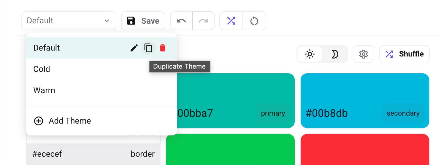
Theme Management#
- Switch Themes: Quickly switch between different theme configurations
- Add Theme: Start with a fresh theme configuration
- Duplicate Theme: Make a copy of the current theme configuration
- Rename Theme: Change the name of your theme
- Delete Theme: Permanently remove this theme
- Save Theme: Save current theme settings with a single click
Undo/Redo System#
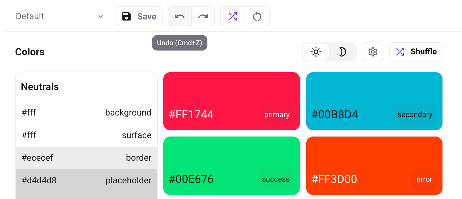
- Undo Button: Revert the last change made to the theme
Ctrl/Cmd + Z - Redo Button: Restore a previously undone change
Ctrl/Cmd + Shift + Y - History Tracking: Keeps a record of your most recent 50 changes
Random Theme Generator#
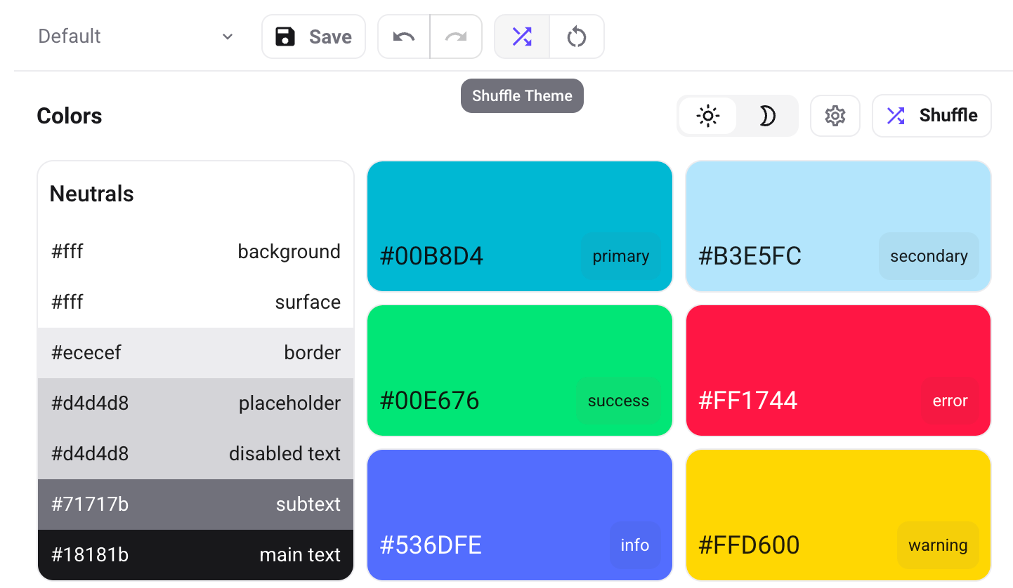
- Shuffle Button: Generate a completely new theme with random colors and fonts
- Smart Randomization: Ensures generated themes maintain good contrast and readability
Reset Theme#
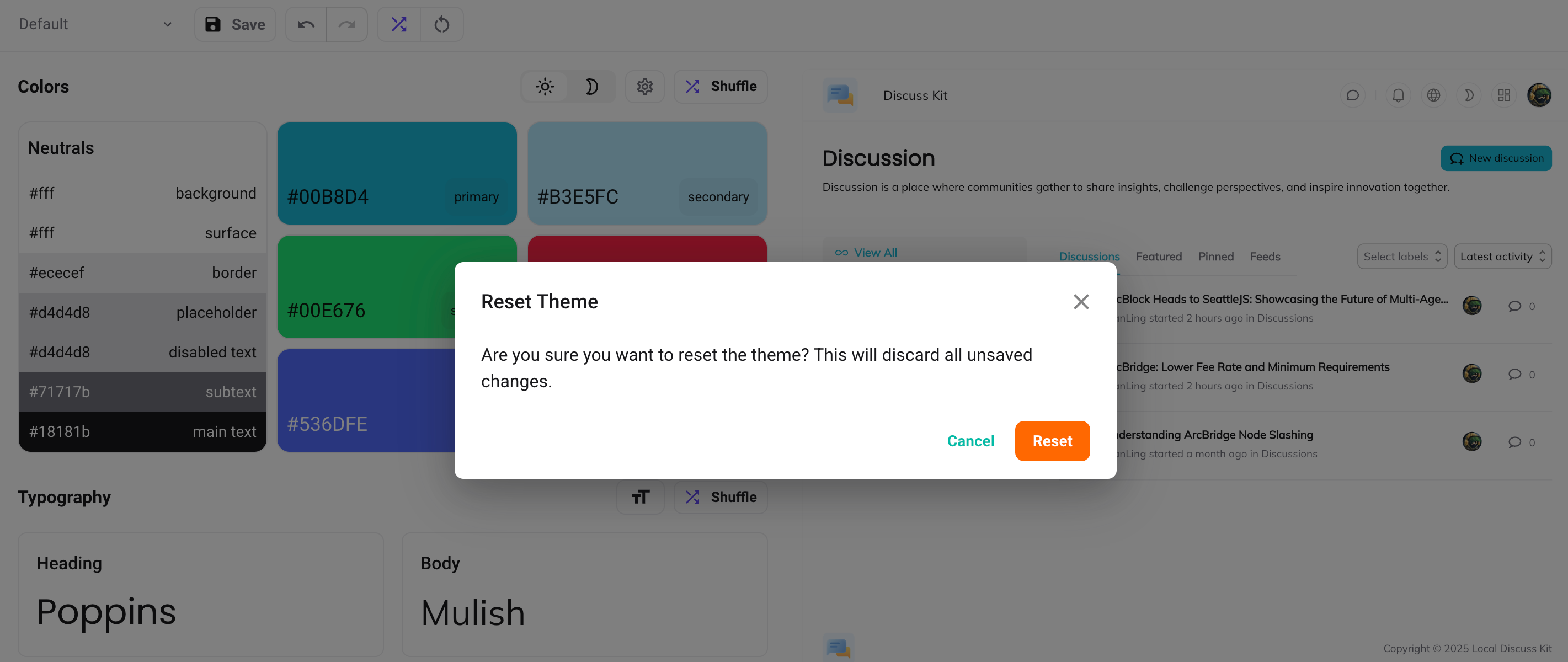
- Reset Button: Return to default theme settings
- Confirmation Dialog: Prevents accidental resets
- Selective Reset: Reset only the current theme without affecting others
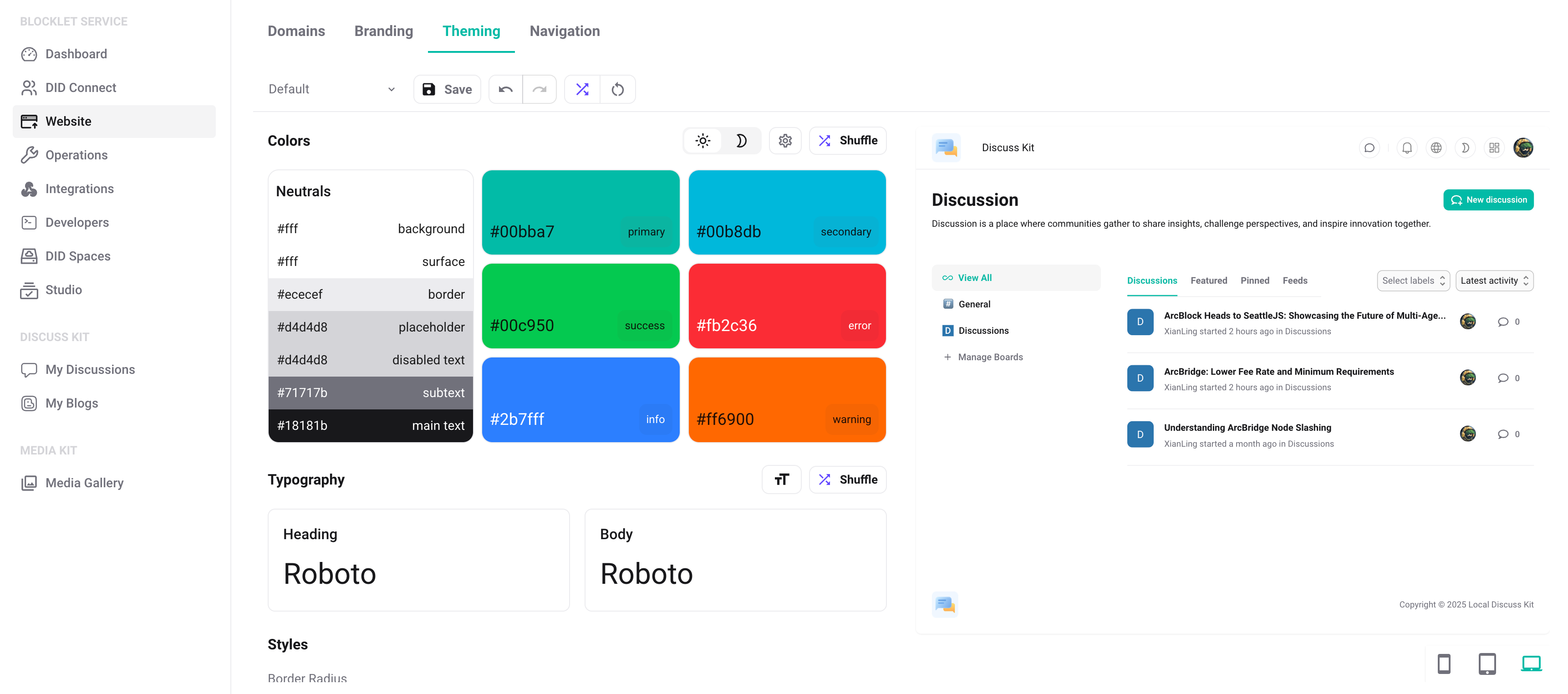
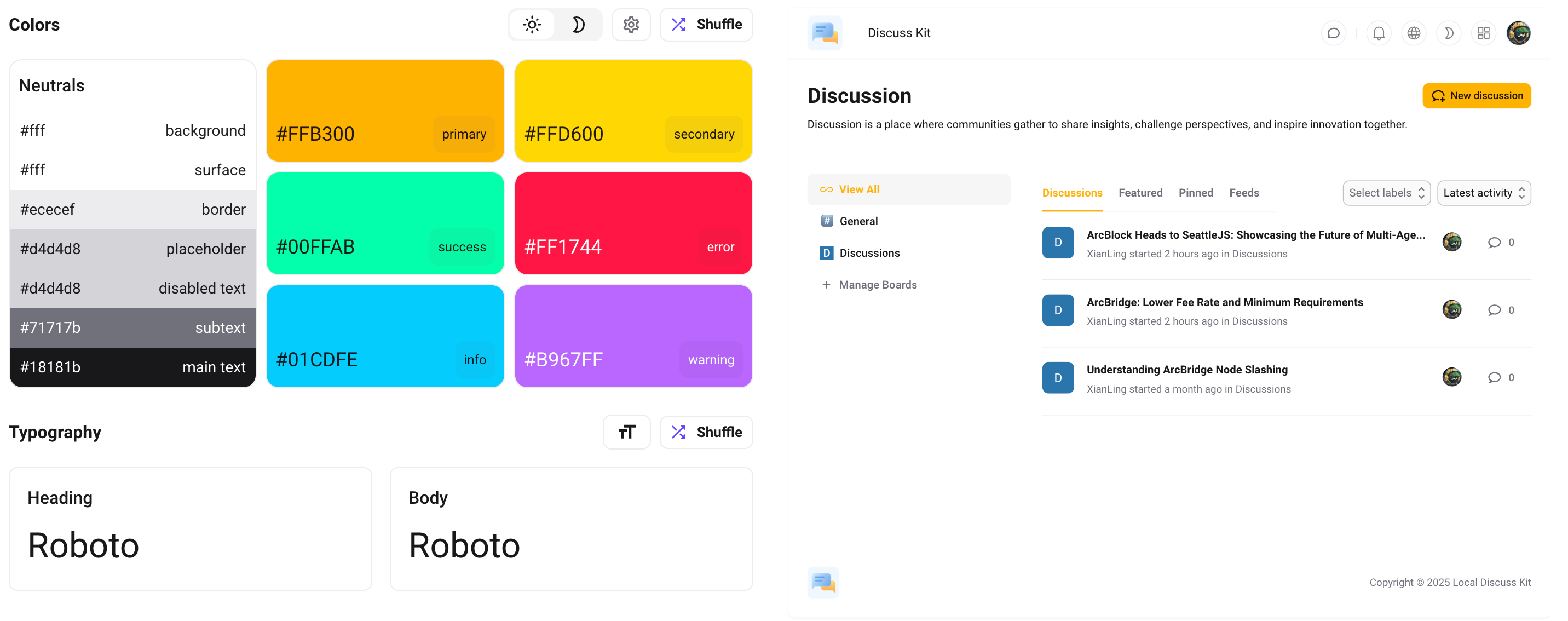
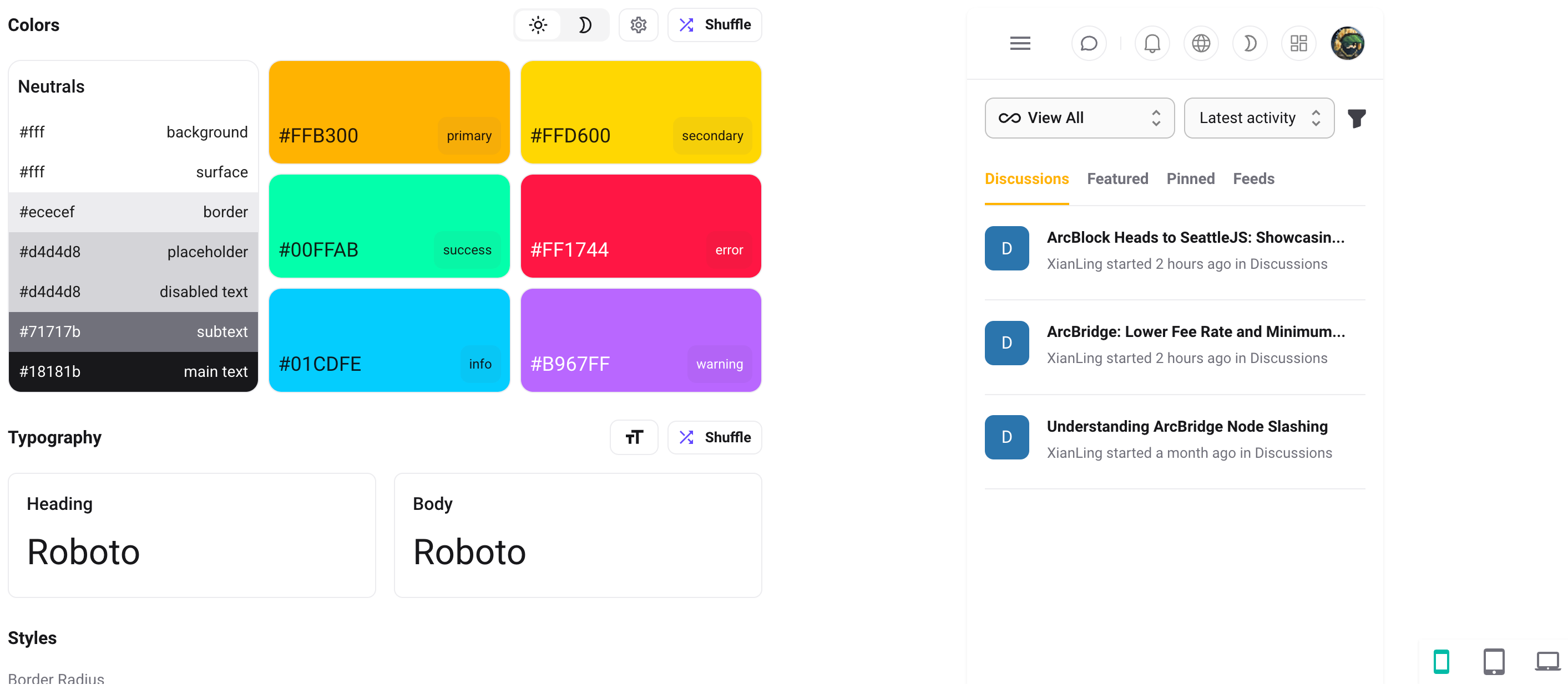
Colors Section#
Light/Dark Mode Toggle#
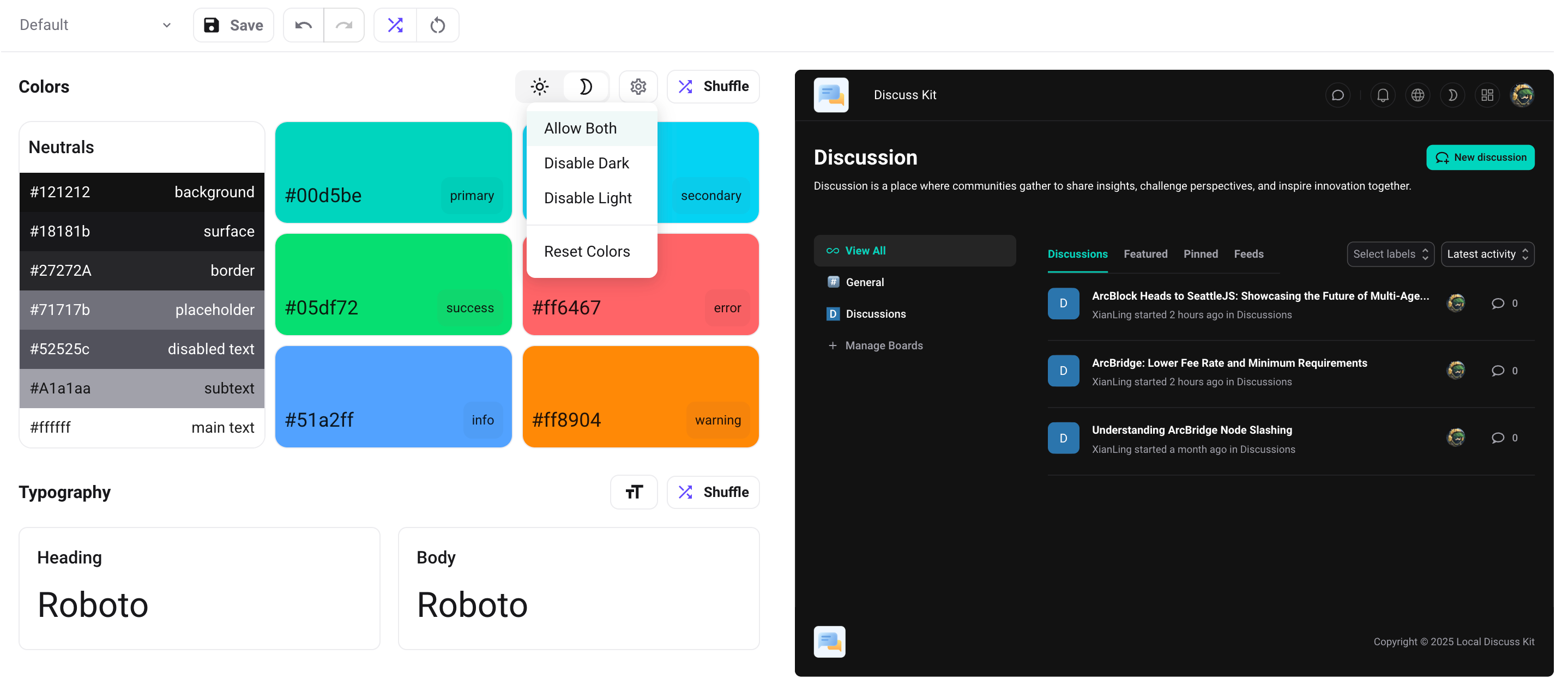
- Mode Switching: Toggle between light and dark themes
- Mode Disabling: Option to disable specific modes based on concept preferences
- Visual Indicators: Clear indication of which mode is active or disabled
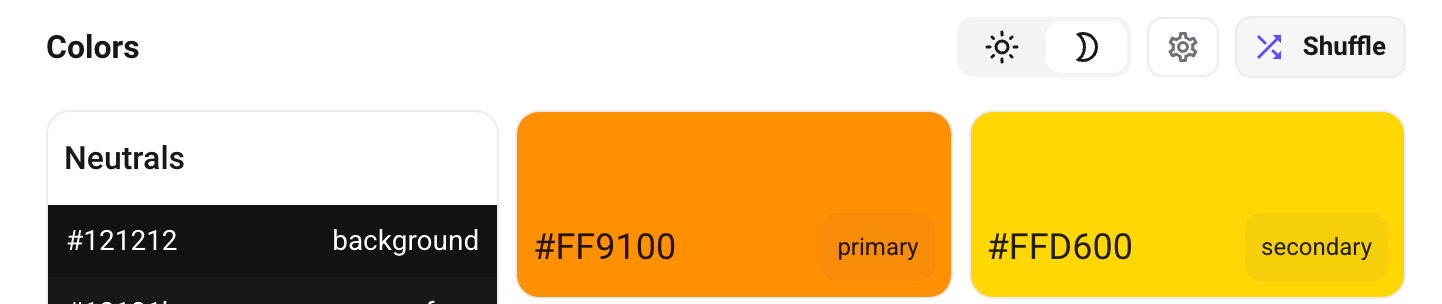
Color Palette Management#
- Primary Colors: Main brand colors for buttons, links, and highlights
- Secondary Colors: Complementary colors for surfaces, accents, and UI elements
- Neutral Colors: Grays and whites for backgrounds, borders, and typography
- Semantic Colors: Status colors like success, warning, error, and info for messages and states
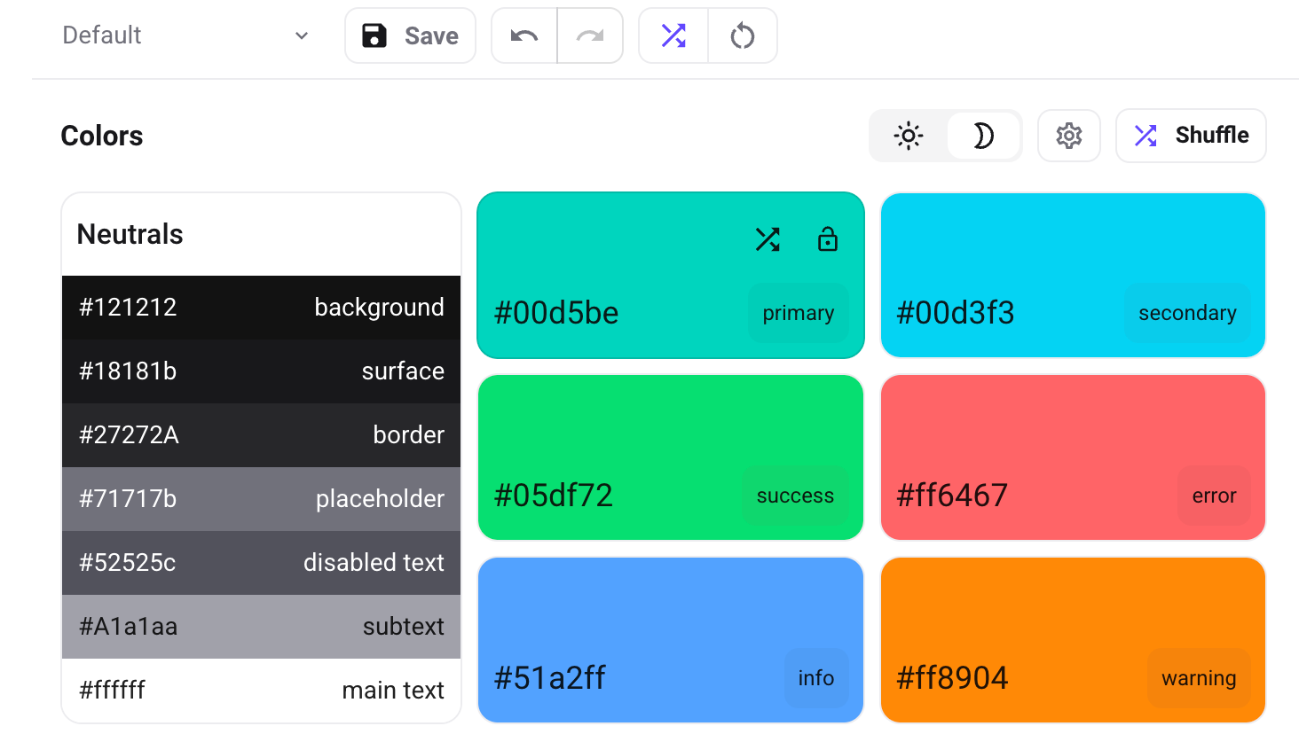
Random Color Generation#
- Smart Shuffle: Generates harmonious color combinations
- Contrast Preservation: Ensures generated colors maintain accessibility standards
- Brand Consistency: Option to lock specific brand colors during shuffling
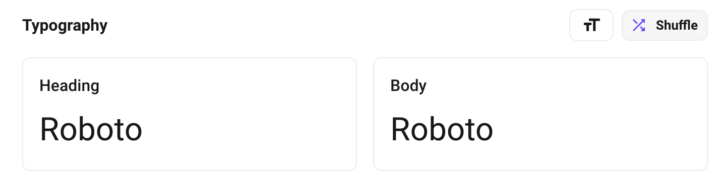
Typography Section#
Font Family Selection#
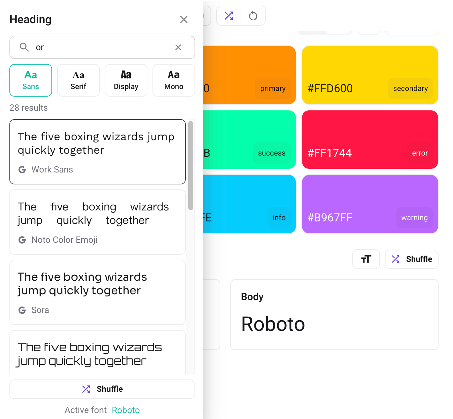
- Heading Fonts: Font selection for all heading elements (H1, H2, H3, etc.)
- Body Fonts: Font selection for body text and paragraphs
- Google Fonts Integration: Access to thousands of Google Fonts
- Font Preview: Live preview of how fonts will appear
- Font Categories: Organized by style (serif, sans-serif, display, etc.)
Font Size Controls#
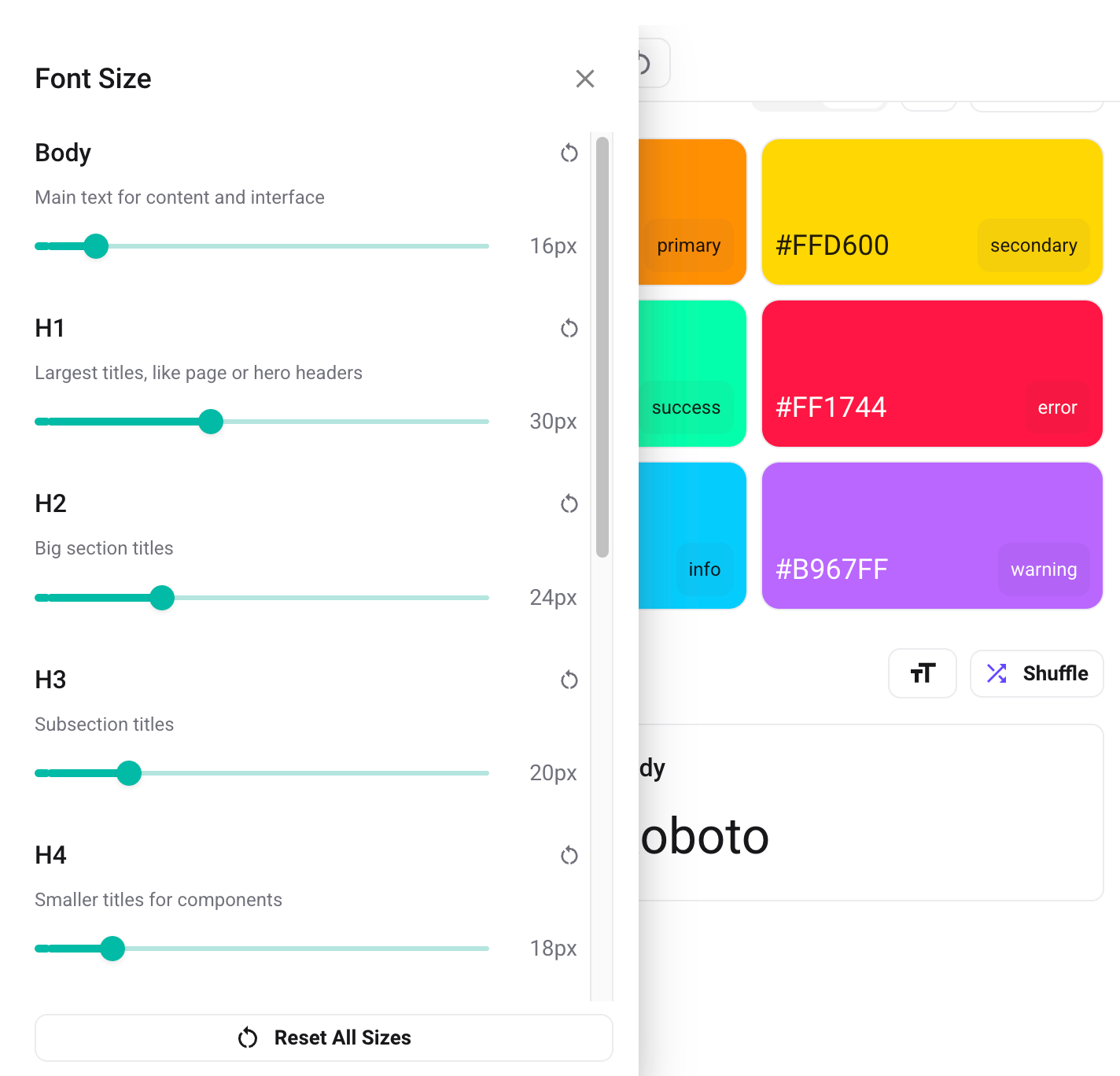
- Global Font Size Scale: Define the base font size to control the overall typography scale
- Custom Sizes: Customize font sizes for individual variants in the theme
Random Font Generation#
- Font Pairing: Smart selection of complementary font combinations
- Style Matching: Ensures fonts match the overall design aesthetic
- Performance Consideration: Prioritizes fast-loading fonts
Styles Section#
Border Radius Control#

- Global Border Radius: Set the default corner radius for components (
shape.borderRadius)
Preview Section#
Real-time Preview#
- Blocklet Integration: Real-time preview of actual applications
- Instant Updates: All changes reflected immediately in the preview
Responsive Preview#
- Screen Size Simulation: Test theme on different device sizes
- Mobile Preview: Optimized mobile layout testing
- Tablet Preview: Tablet-specific layout verification
- Desktop Preview: Full desktop layout testing